Segurgam 2024
Segurgam is an insurance company that wanted to refresh its image to better connect with its clients. The challenge was to build a visual identity that conveyed trust without losing warmth — moving away from the corporate coldness so common in the industry.
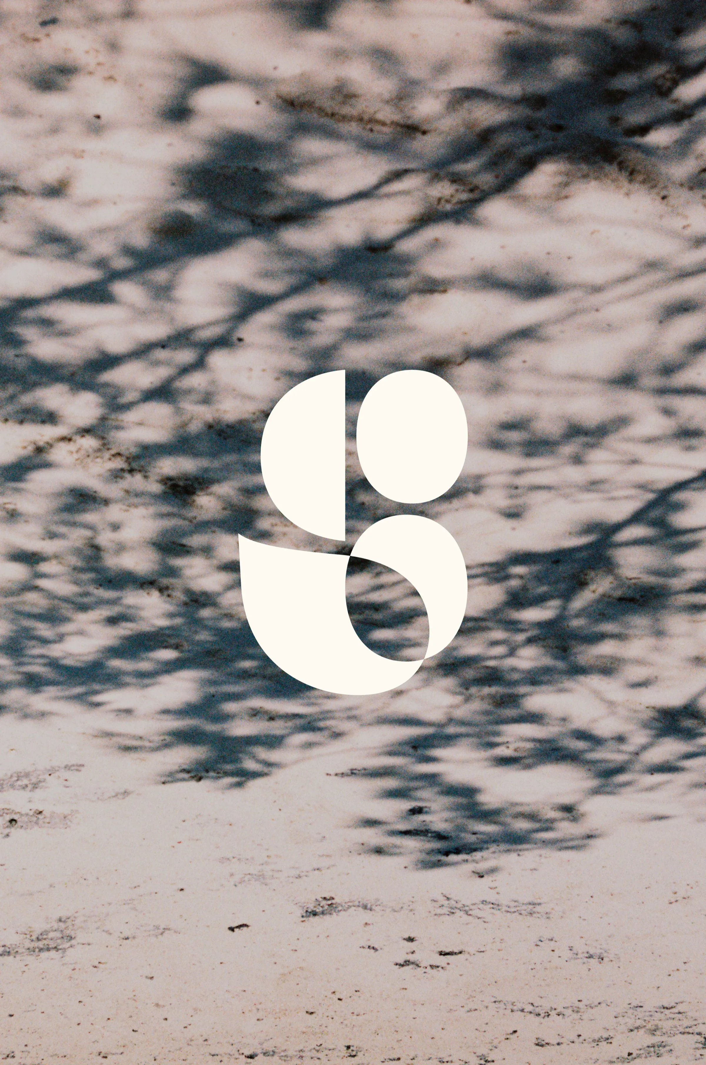
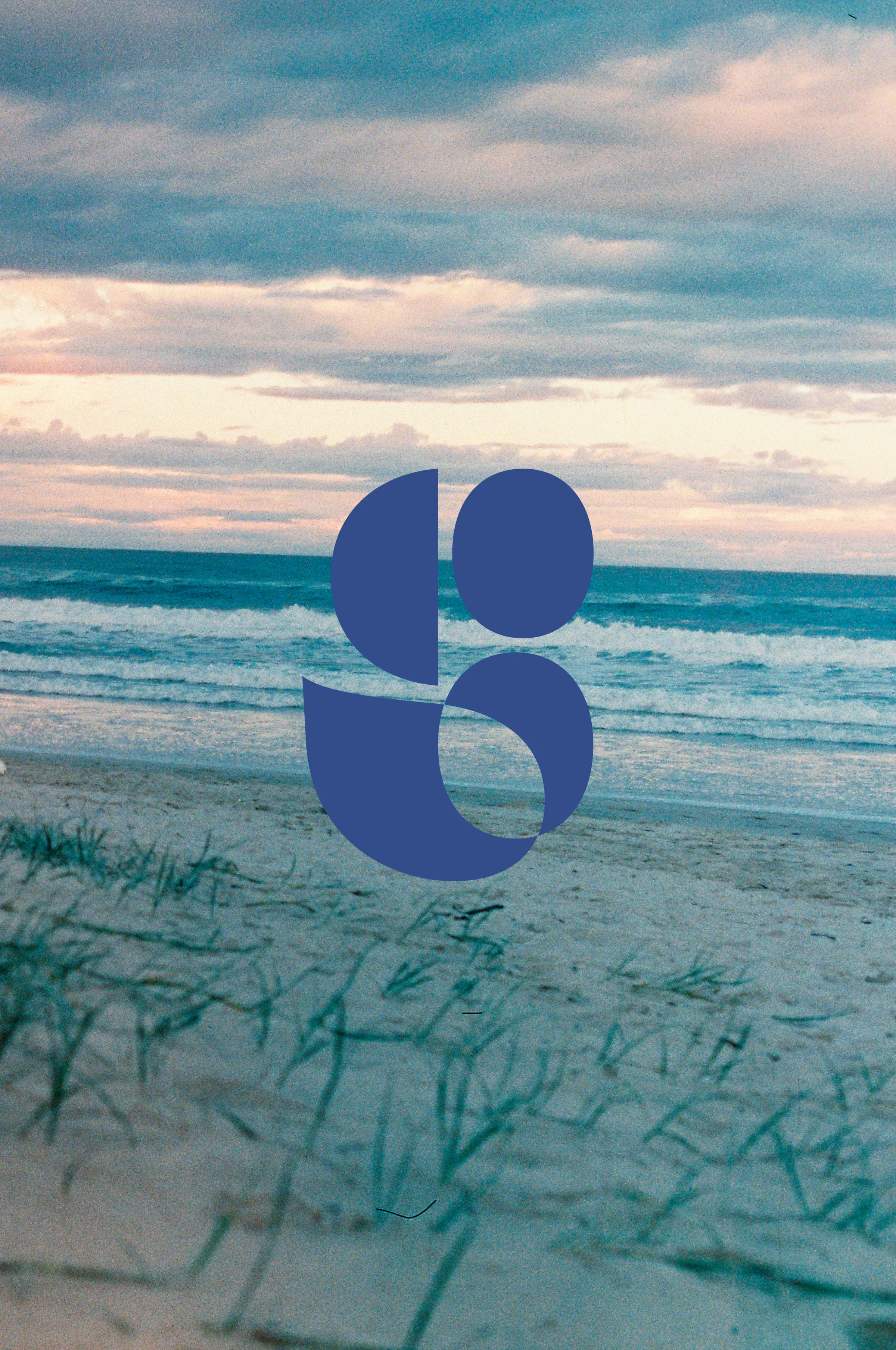
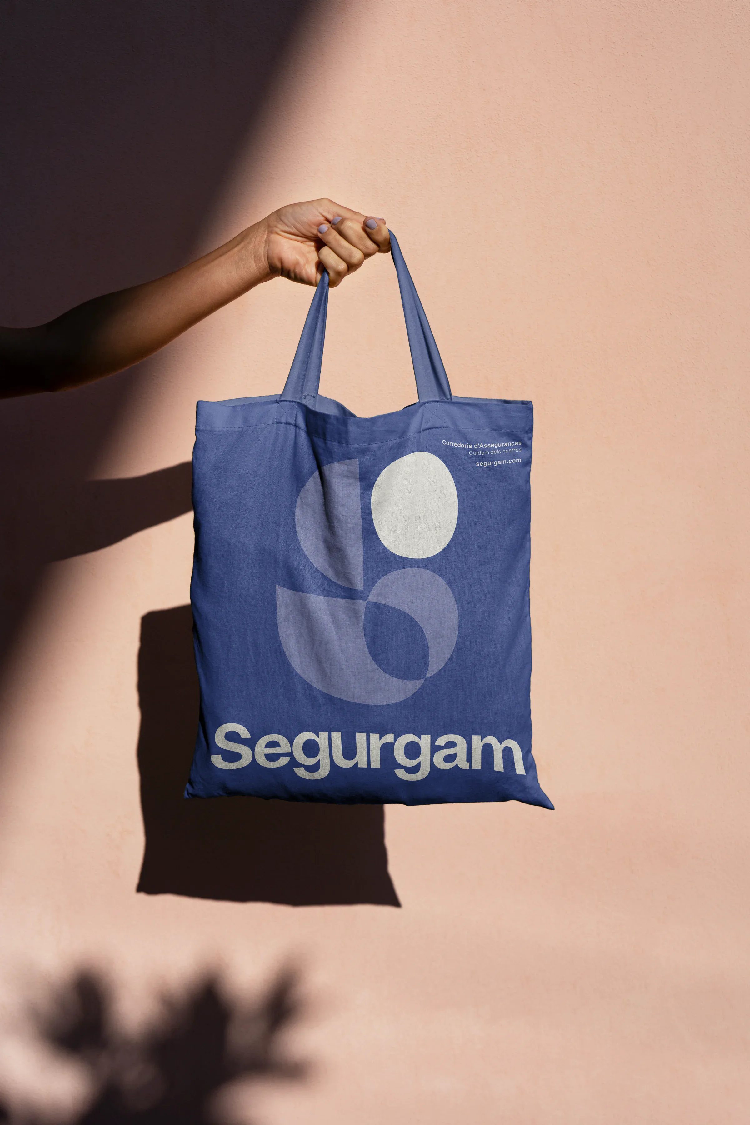
The new logo mark combines a modern and elegant sans-serif typeface with a distinctive symbol: the letter S, which is not drawn in a conventional way, but instead emerges from the negative space between the letters e, g and a, giving rise to organic shapes that evoke care, delicacy and familiarity — a visual metaphor for something that is always there, protecting, even when unseen.
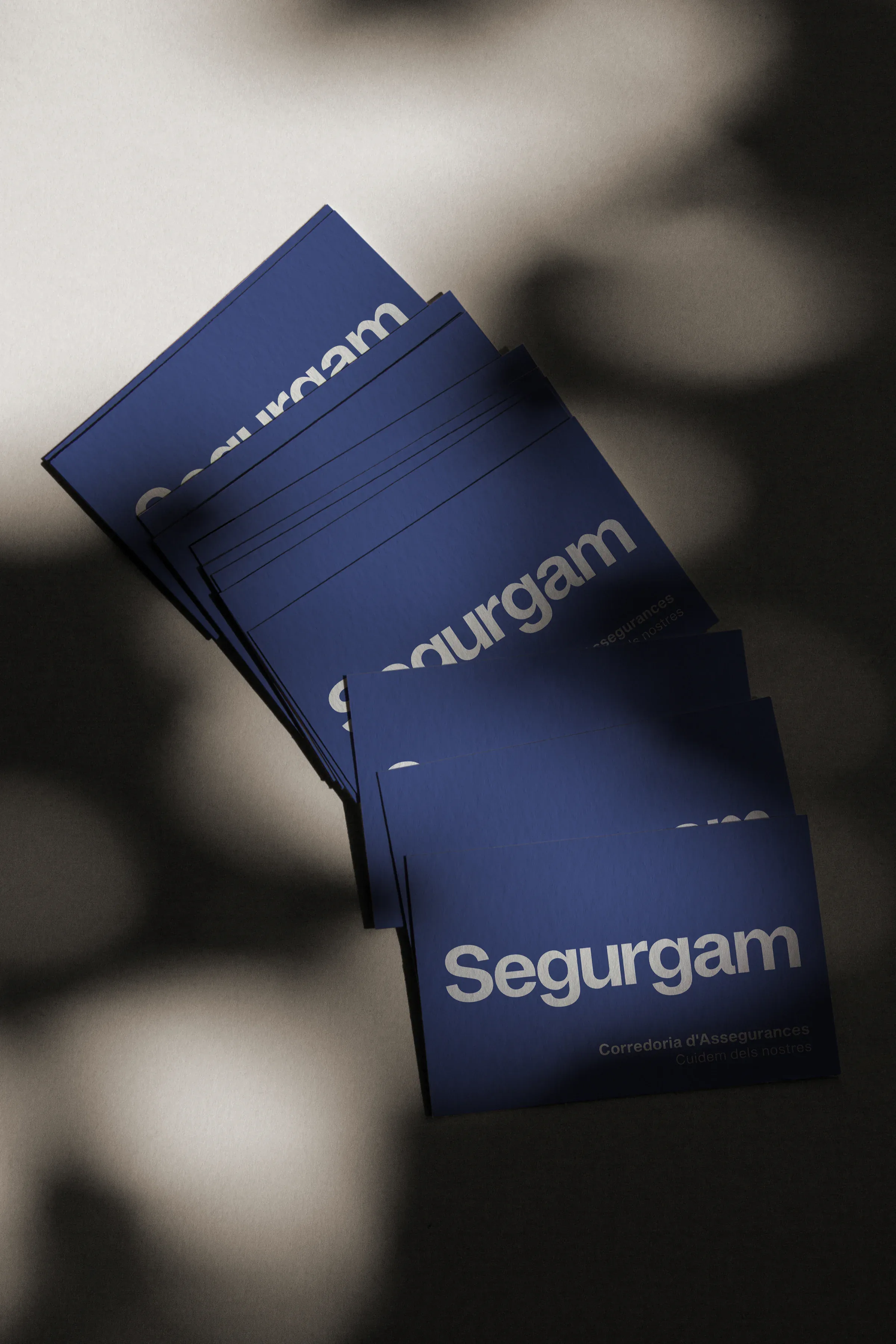
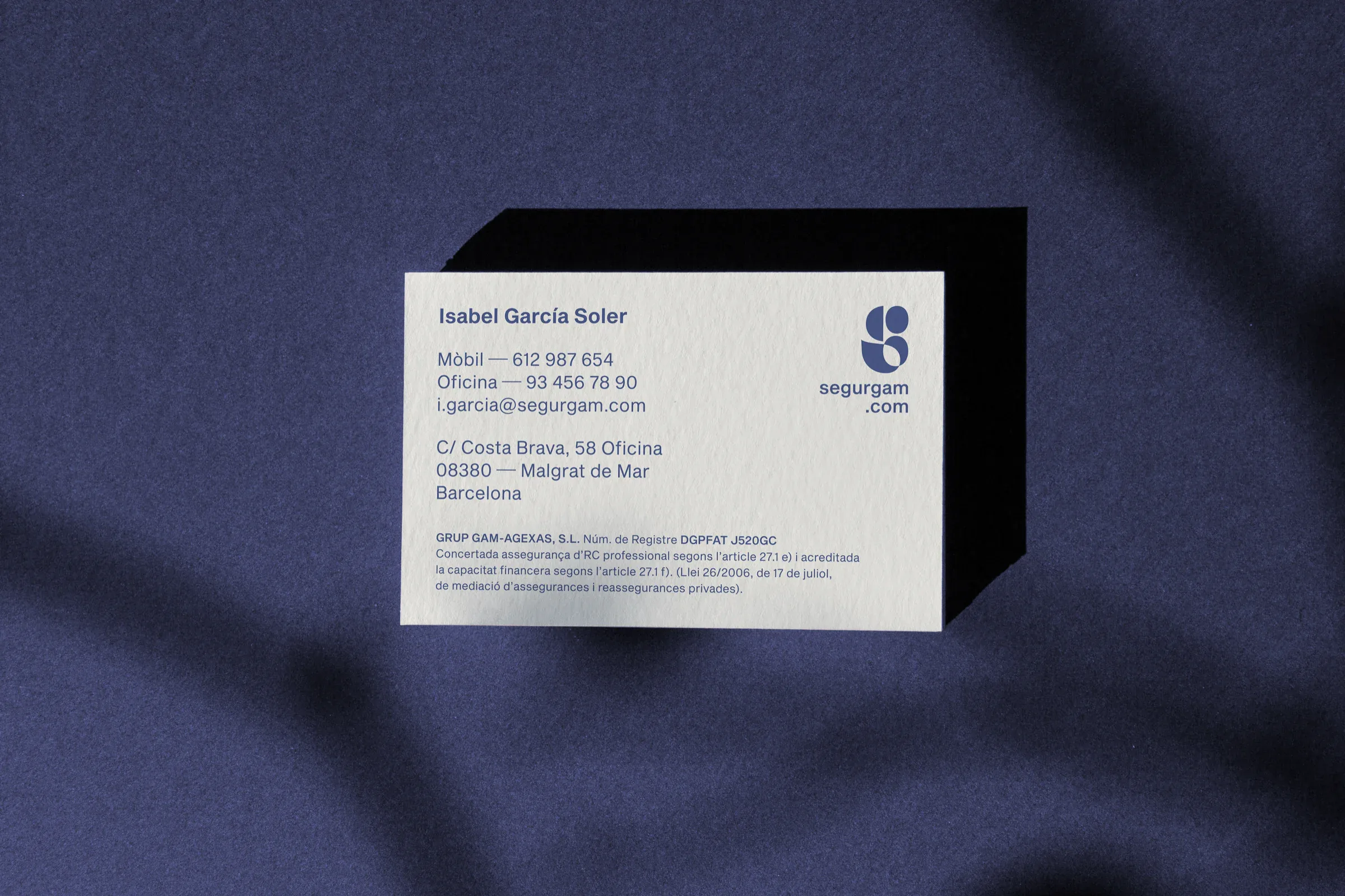
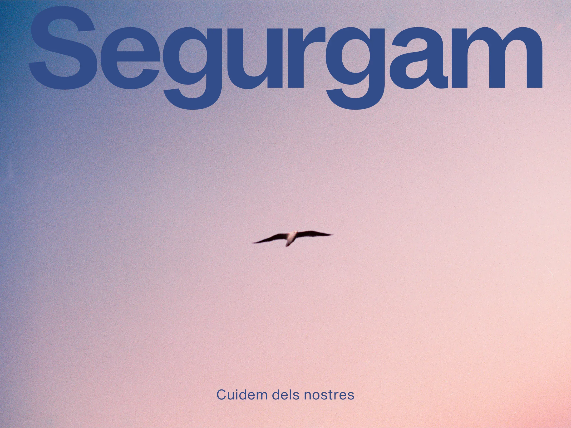
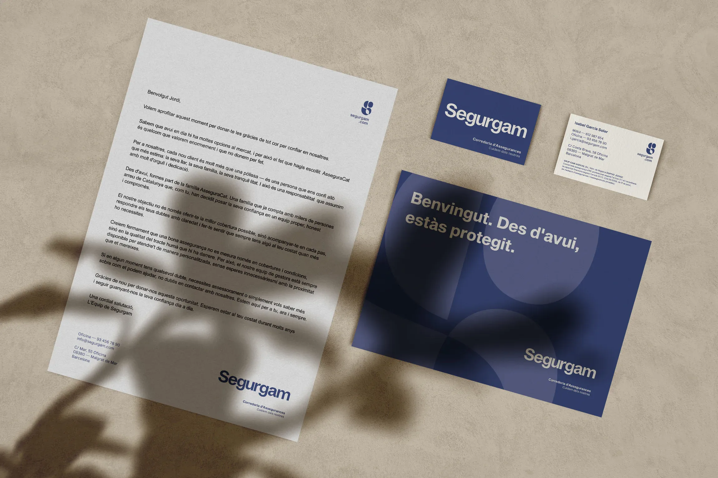
The entire identity system is inspired by the brand's new tagline, Cuidem dels nostres (we take care of our own), and revolves around that same idea: protecting what matters most, with warmth and closeness.
Pisito Studio